
Epicurious iOS App
The relaunched iOS app from BonAppetit.com and Epicurious.com relaunched as a combined library of 50,000+ recipes from all the Condé Nast food brands like Epicurious, Bon Appétit, Self, and Gourmet. This relaunch also marked a move to a subscription product with enhanced capabilities.
CONDÉ NAST, 2022-2025

SMALL TEAMS ARE POWERFUL.
The Epicurious App team at Condé Nast included 1 Designer, 1 Product Manager, 5 Engineers, 1 Design Director, 1 Engineering Manager, and 1 Product Director. I designed the core structure, defined the UX, created a component library, and developed specs for visual and motion interactions across iOS devices.
A ROLE I GREW INTO
I went on to become the design owner of the app post-launch as our team grew, to see it through updates and new features such as vertical video integration, enhanced search and saving capabilities, personalized preferences, a streamlined subscription flow, and commenting over the next 2 years.
Typography and Color
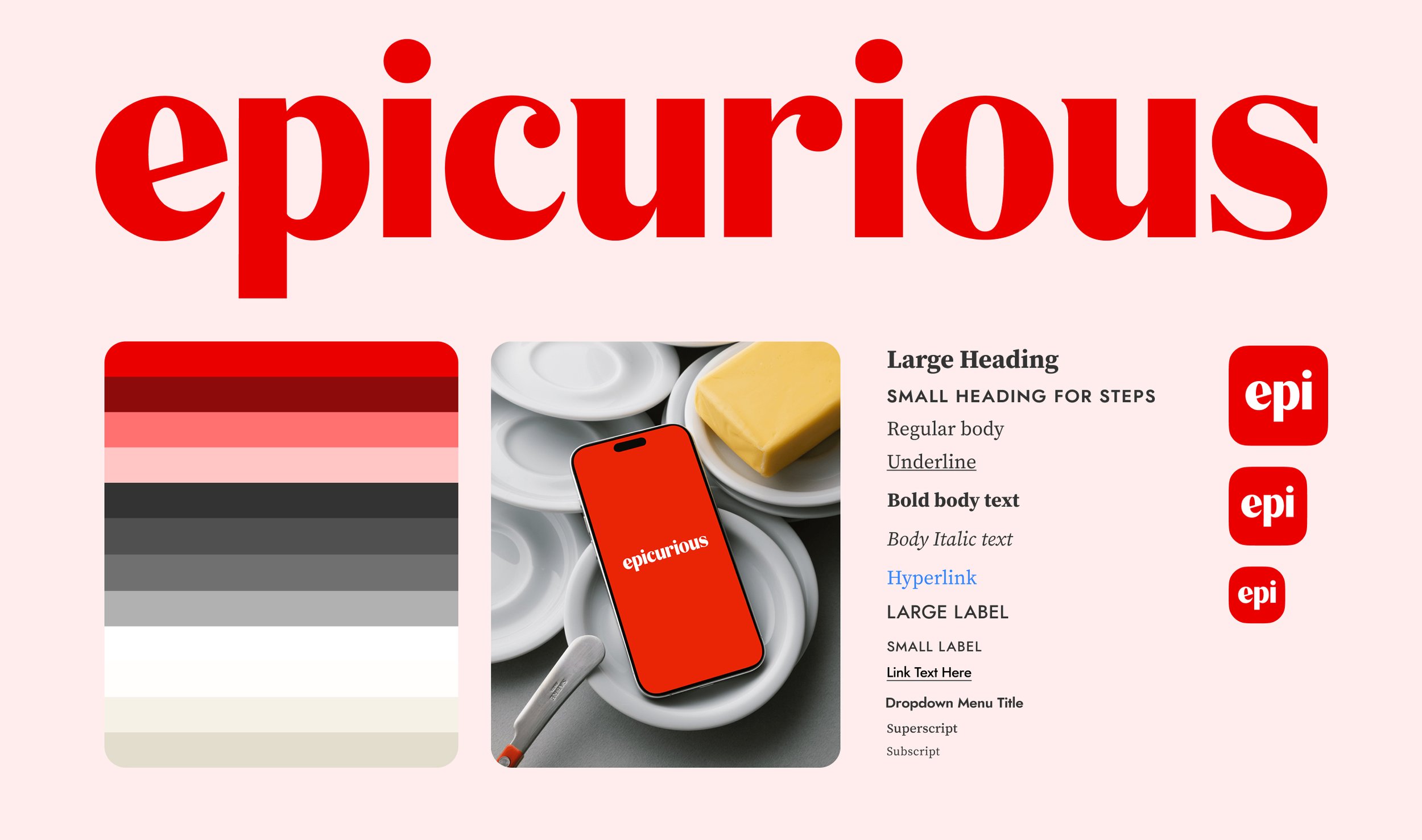
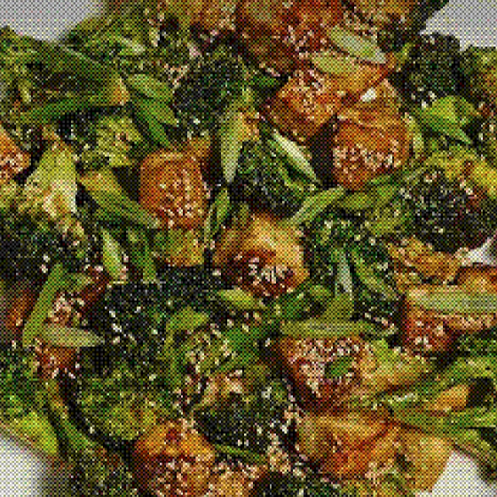
Sister sites Epicurious.com and BonAppétit.com both share a focus on vibrant, in-house food photography and imagery. All brand images usually consist of immaculate visual plating, liberal use of seasonal ingredients, and high-contrast colors and composition. Photography is the brand's biggest asset, and we wanted to complement that.
Empty Spaces and Quiet Moments
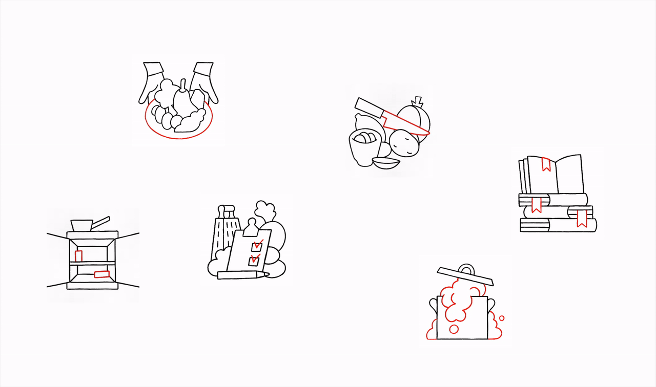
As a finishing touch to the Visual Design piece, we worked with artist Lennard Kok to create these illustrations for the new app, and welcome new and existing audiences to the new possibilities we had to offer, such as bookmarking, shopping lists, seasonal ingredients, personalized preferences, and an improved search experience.
Driving Design Consistency
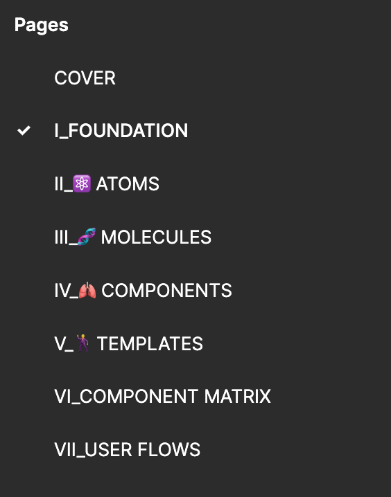
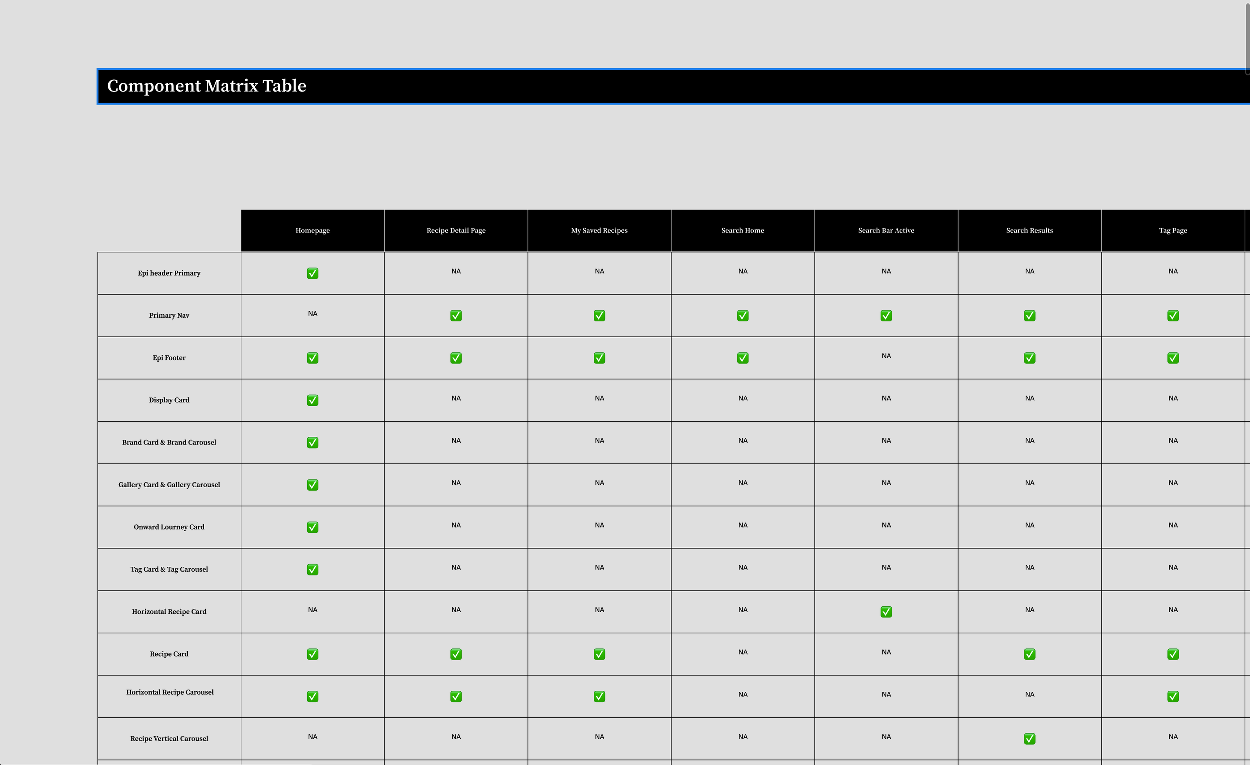
ATOMIC DESIGN SYSTEM
Structured as modular building blocks of color, typography, and spacing, ensuring consistent branding and styling across screens. A lightweight and efficient design system with multiple reusable components was key to keeping the image-laden app light on load time.
COMPONENTS THAT OFFER VERSATILITY
We created a comprehensive suite of UI components — buttons, input elements, navigation elements, a bouquet of recipe cards, and image resizing formulae that adapted to devices and orientations of screens.
GUIDELINES, BEST PRACTICES, AND A SINGLE SOURCE OF TRUTH
We studied the primary architecture setup in Swift UI by our dev team to provide the best, in-depth guidance on design fundamentals (typography, color, spacing), hierarchical design, accessibility standards and responsiveness. Our reusable, scalable, responsive components were published and communicated in Figma workflows to streamline collaboration.
Core Structure
Personalization and Preferences
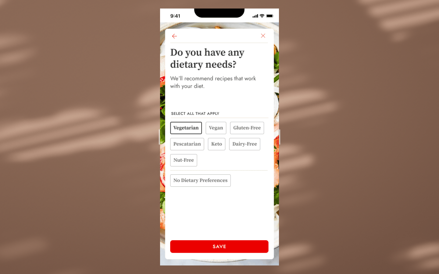
Users can set dietary preferences during onboarding which drives their recipe discovery experience. We created an original set of questions that focused on not just dietary preferences and allergies, but expertise in cooking, and cuisines preferred. Eventually due to the technical constraint of having only “add” filters, and not “remove” capabilities in our backend structure, we settled for a slimmed down journey that focused on dietary needs only.
Homescreen
We tested two prototypes with a user group: one based solely on onboarding preferences and another mixing preferences with curated recipes. The feedback informed our MVP. Analyzing search keyword data revealed users searched by ingredient, seasonality, and complexity. We leveraged this to add upfront categories like "one pan dinners" and "easy," which our editors seasonally updated.
KEY TAKEAWAYS
Dietary concerns were the most important user preference.
User preferences and recommendations should be highly visible on the homescreen, as they were seen as key and important modules.
A balance needed to be struck between a good scrolling length, a visually diverse screen, and avoiding an overwhelming experience.
Users consistently requested that "Your Recently Saved & Viewed" be listed first under "Dinner Tonight."
Users appreciated the ability to add different meal types in the "More Ideas For You" section.
One user commented, "Recipe of the day is kind of fun. Love that!"
Users who selected a dietary preference did not want content outside of that preference to appear on the homescreen.
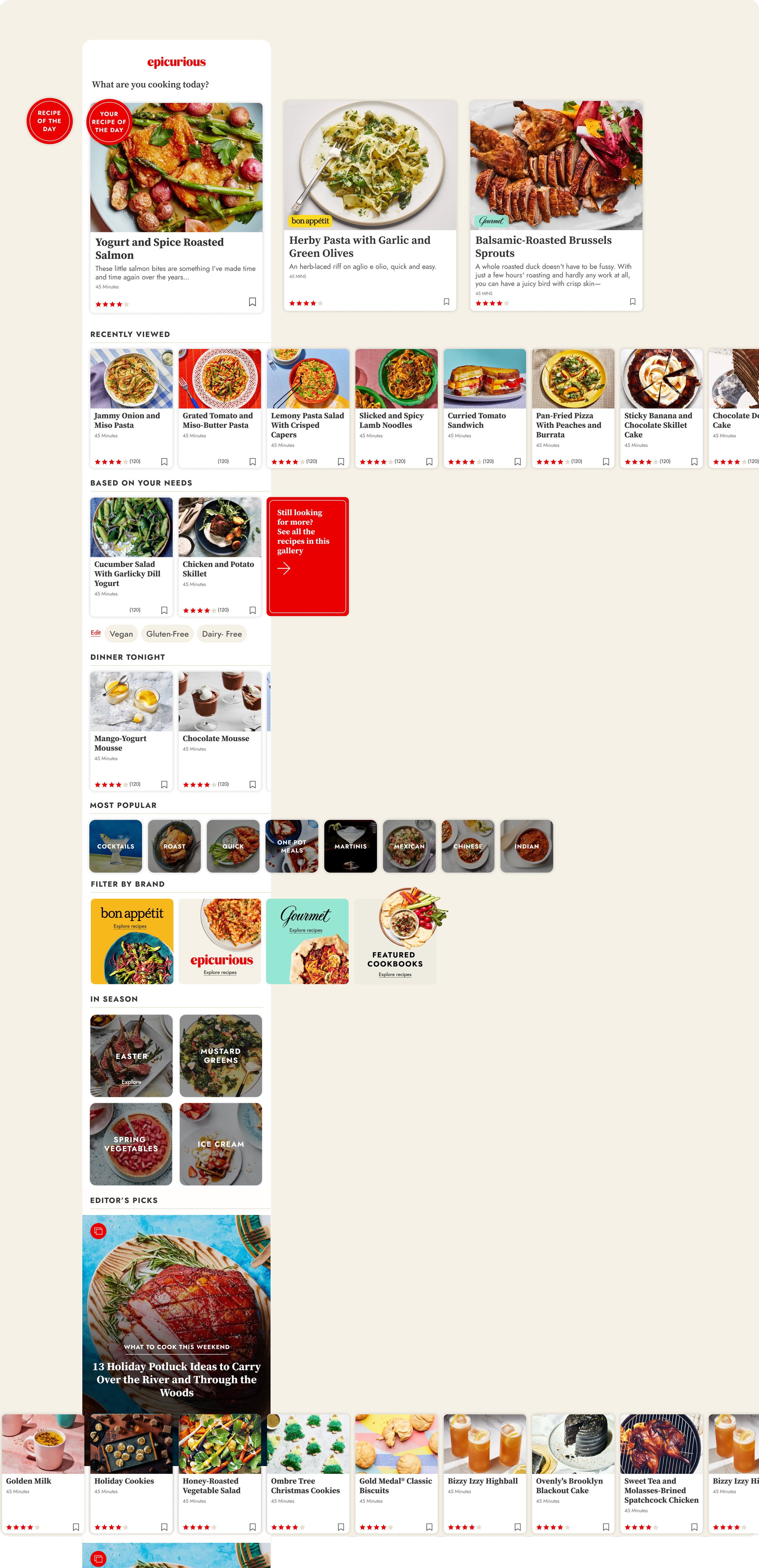
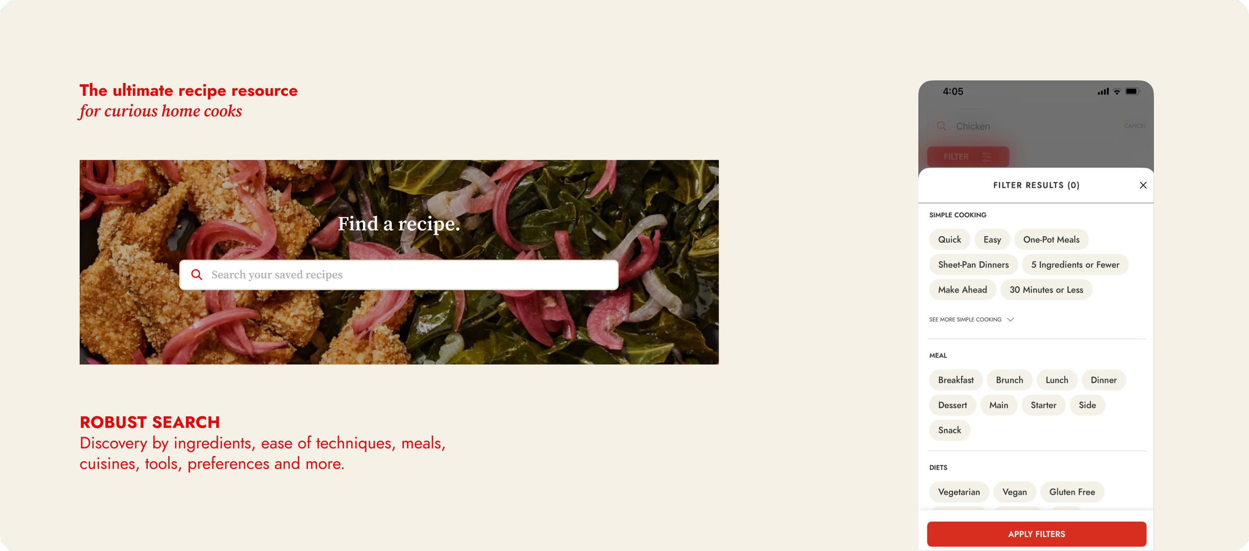
Utility and Search
Search is perhaps the most critical and frequented tool in the entire app. A page that sees some of the highest rates of engagement, and utility. We added advanced filtering by ingredient, dish type, diet, and occasion. Search patterns taught us a lot about app usage and helped us improve the parameters of various aspects of the app. We introduced a ML based search in 2024, which boosted time spent by 11%.
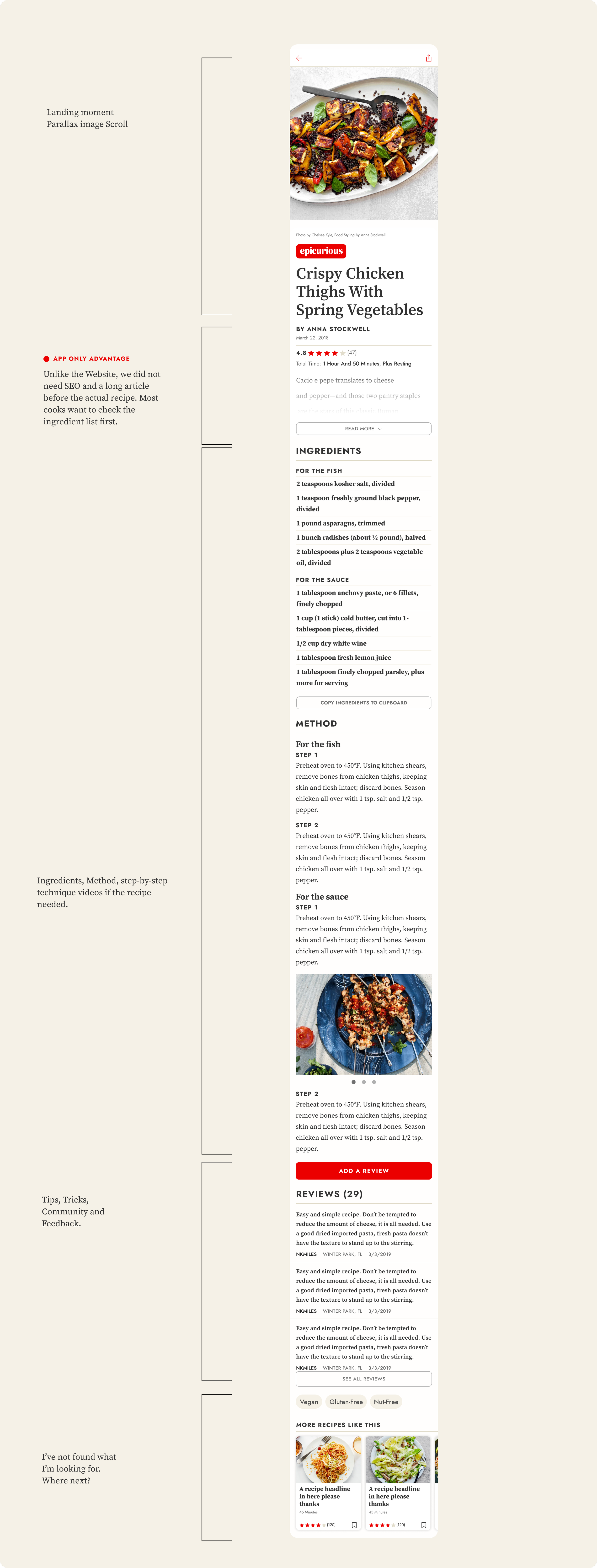
Recipe Detail Screen
The recipe detail page serves as the final destination for users preparing to cook a recipe. Users often revisit this page multiple times, skimming the ingredients list, method, and next steps. Once on the page, users may either quickly review the ingredients and return to browsing or, if they choose the recipe, spend a considerable amount of time on the page, referring to it as needed.
We created an enhanced user experience with a new immersive design and easy to follow structure.
Year 2 Improvements
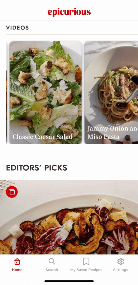
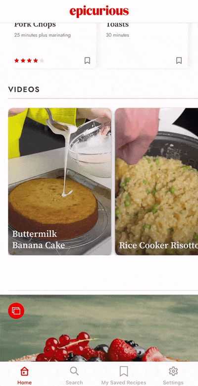
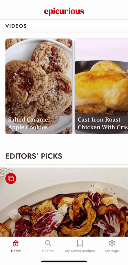
Visual Galleries Experience
Visual storytelling using galleries on the home screen to incorporate moving images and more impactful use of Epicurious’ beautiful food photography. We redesigned all instances of the how a collection would appear, whether on the home screen, or a card within a search result. Seasonality, occasions, long weekends, holidays, all provided an opportunity for our readers to rediscover the archive.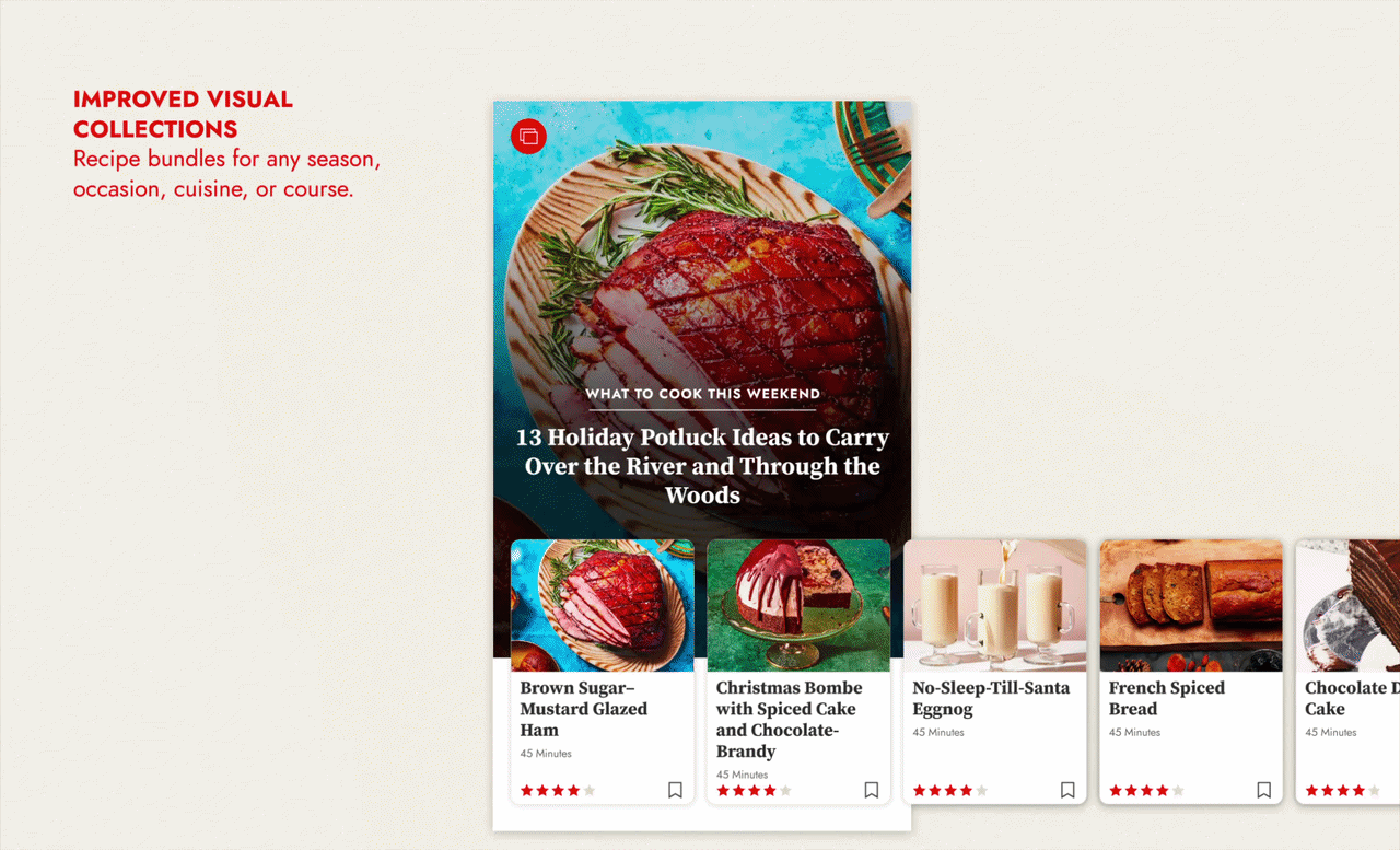
Year 2 improvements
Vertical Video Integration
Bon Appétit's YouTube channel has accrued over 2 billion views, this presented an opportunity to integrate video into the app. We partnered with Firework to deliver native vertical videos, linking directly to in-app recipes. To enhance our offering, mobile-native, vertical, short, "snackable" videos, creating an engaging way for users to explore our recipe archive. We found that video users spent 3x more time on the app compared to typical users.
Year 3 improvements
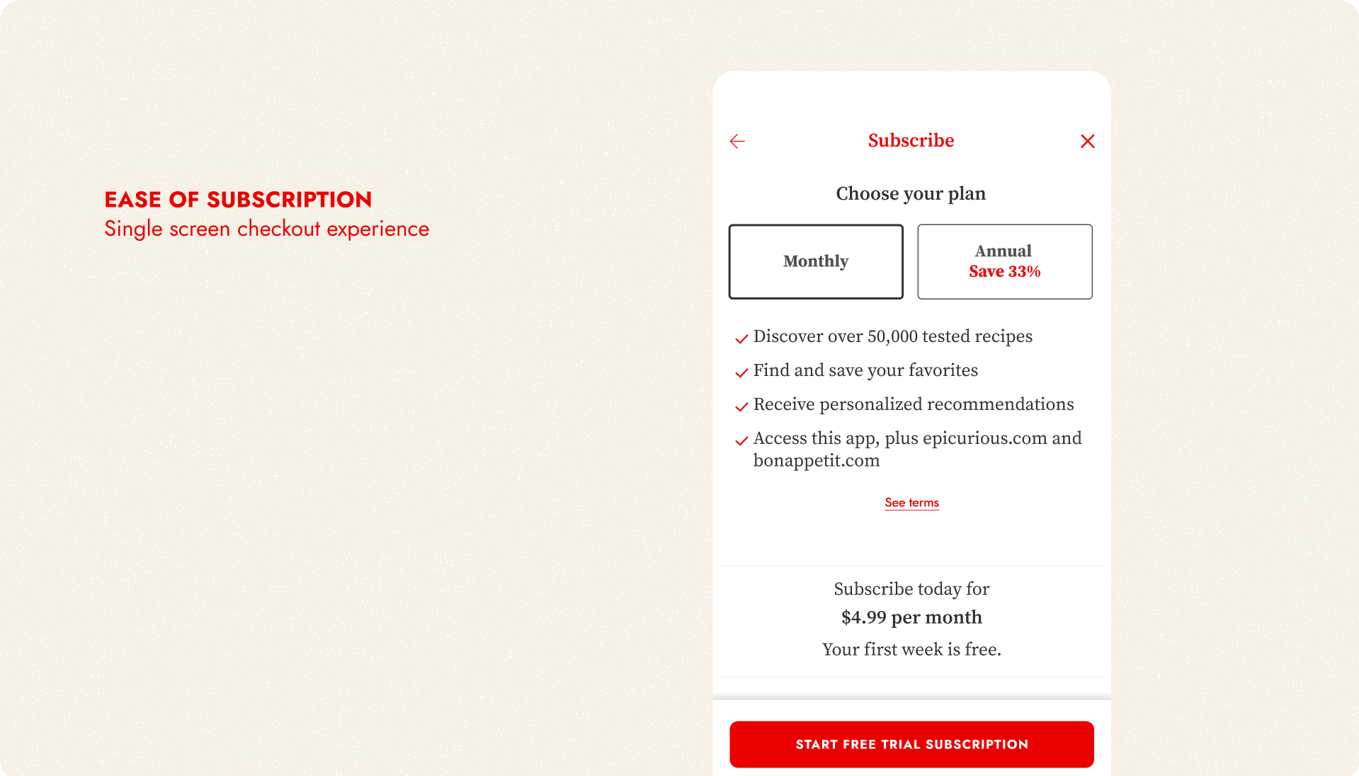
Streamlining Subscriptions & Settings Flows
I joined forces with our other app design teams at The New Yorker and Vogue Runway, along with Content Design, MarTech, Marketing and Product teams, to design a standardized approach to the in-app subscription flow, free trial, and paywall screens.
We saw an our overall jump numbers in Audience & Engagement by simplifying subscribing at various touch points across both apps.
Year 3 improvements
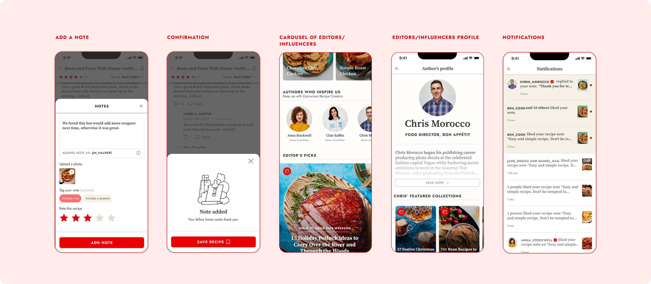
Commenting & Community
The objective here was to strengthen the app's community platform by creating a space for users to interact, and home cooks to share and exchange ideas and feedback with our editorial staff. Prior to this, the editorial team utilized social media comments for events, cooking groups, and seasonal promotions, and our intention was to bring that engagement and user base into the app.
I contributed to the project's early design stages, after which a junior designer from my team handled the implementation and execution.
Team Wins
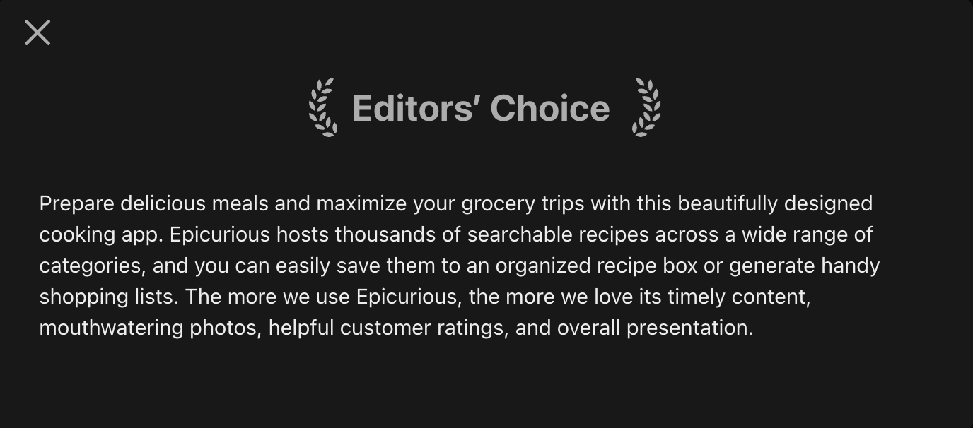
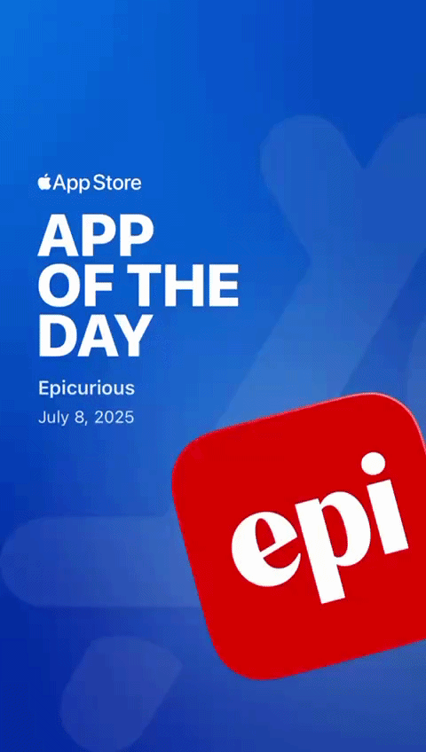
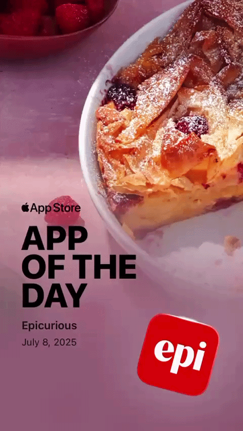
The Epi App was awarded App of the Day by the Apple App Store 3 times in the US and once in Canada. It was picked as the Editor’s Choice in the App Store cooking category.
We reached a sizable audience of over 600K users while generating meaningful engagement (Sessions: 3M+ Screen Views: 17M+ Recipe Saves: 1M+, ultimately driving consumer revenue over $1.4M).

Collaborators
Design Director
Peter RobertsonVP of Product
Mindy ChenPritha Khasnobis, Taral RathodEngineering Managers
Designers
Irina Birt Wiggins (Lead), Pallavi SoniProduct Managers
Meenhaz Ahmed, Vivek DayalProject Manager
Anne Dehmer