

upReach.org
upReach is a UK-based social mobility charity that helps students maximize their potential and achieve their academic goals. The scope of this project involved rebranding, designing the visual language, and redesigning the seven sister websites for the various upReach products, with upReach serving as the easily extendable and recognizable mother brand.
This project took place during my time at 1stMain, a design agency.
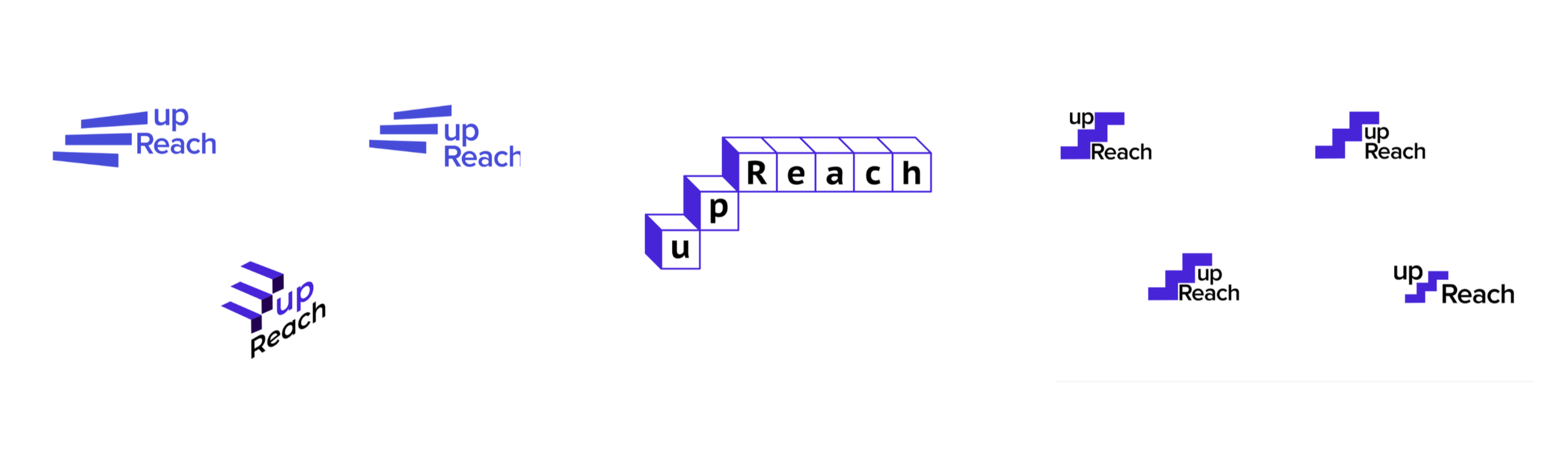
The Staircase as a Metaphor
Not everyone starts on the same rung of the ladder, with upReach, students can take steps to better their future. The staircase represents the idea of stepping up to success for higher education and better work opportunities that are afforded to only those from elite institutions.
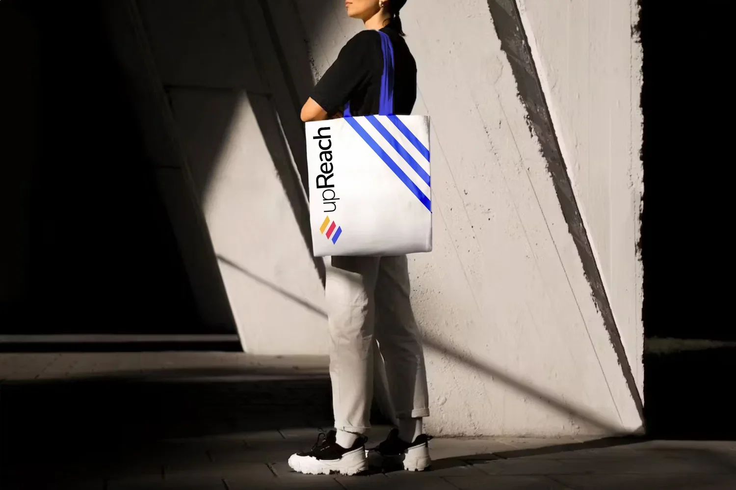
The upReach Brand

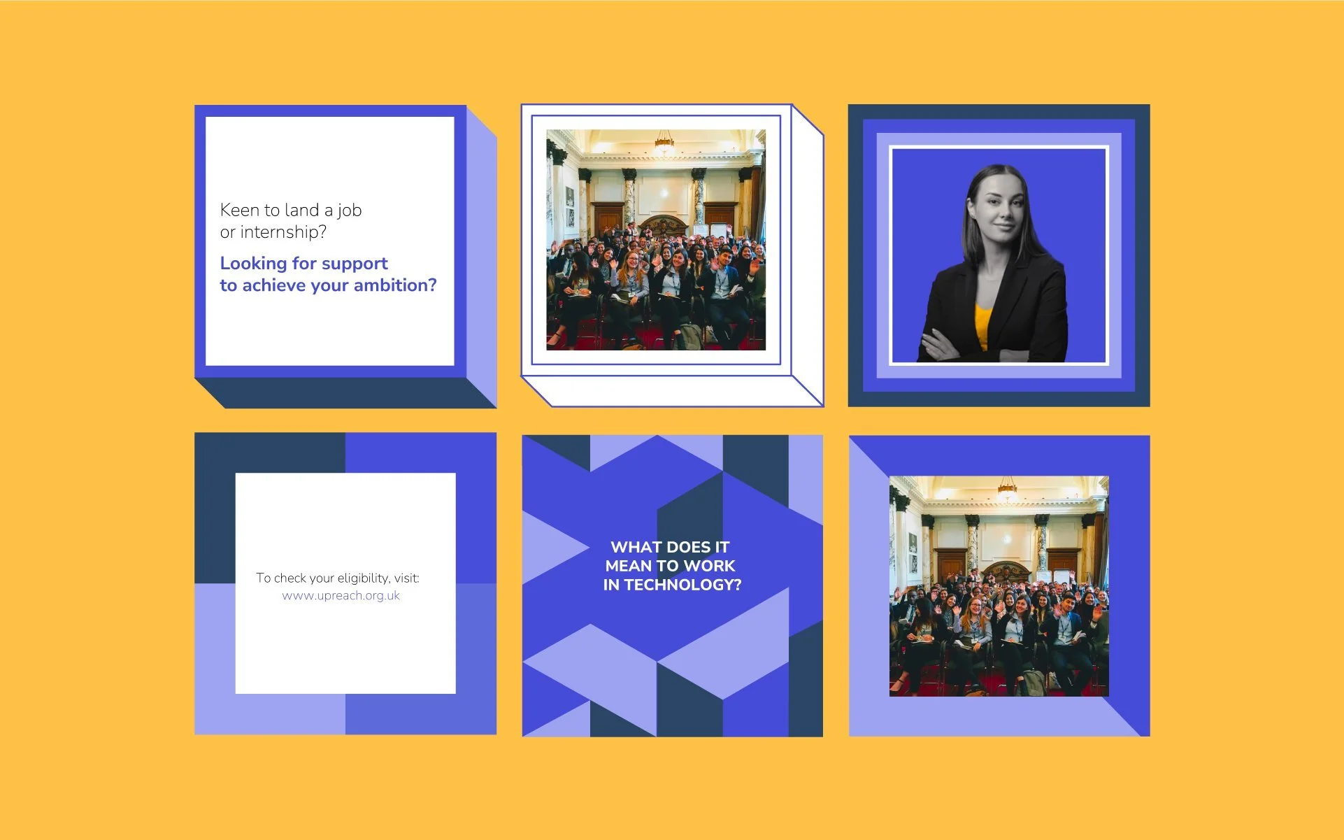
The family of logos draws from the steps a student will take on their journey to a successful career, capturing upReach’s role to support students from lower socioeconomic backgrounds. An updated colour palette allows the staircase design to be used across upReach’s extended system. The colour palette was expanded to add a variety of bright and youthful colours. The palette was redirected towards some digital-friendly choices and customised to suit every different product of the upReach brand. 


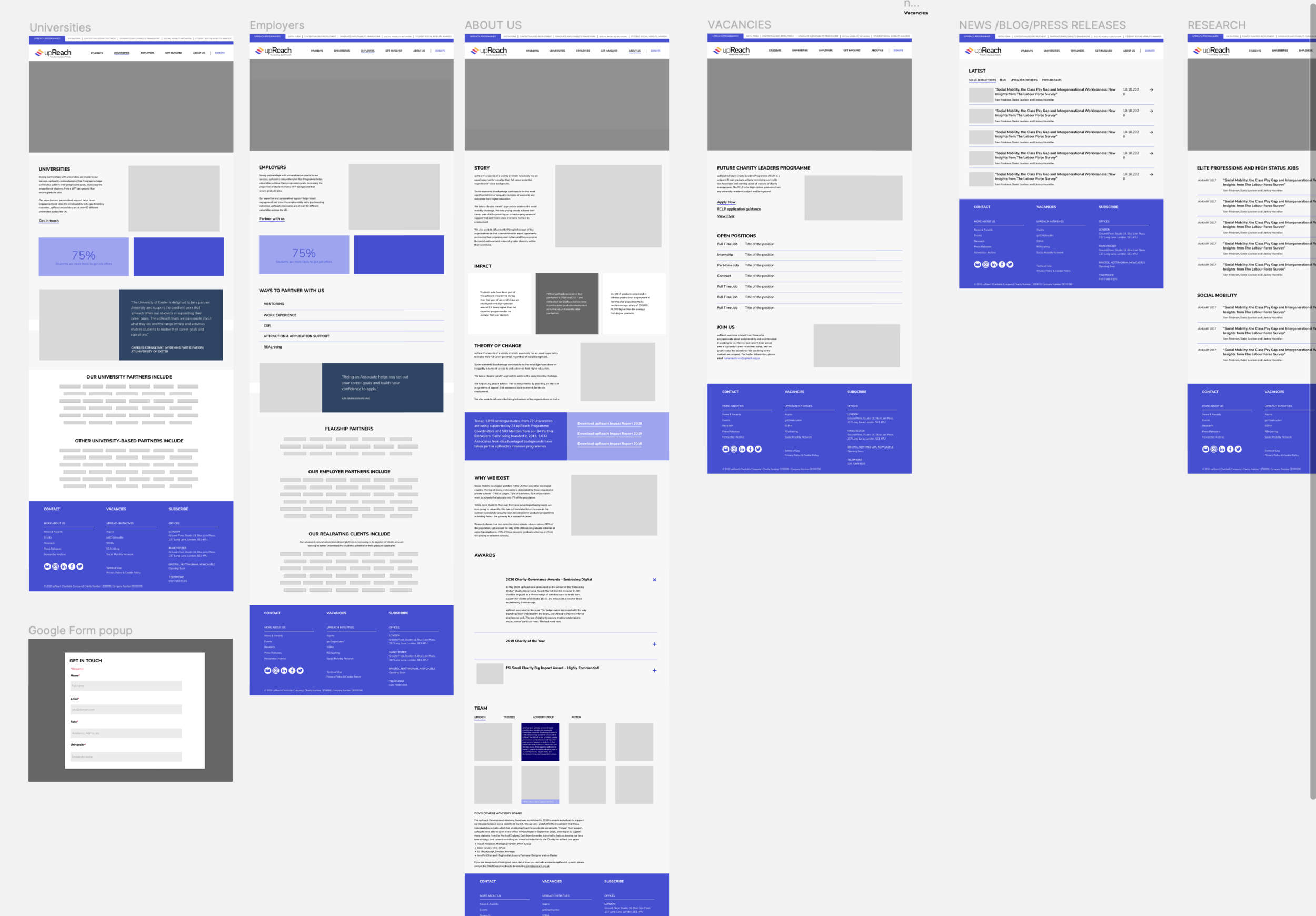
Website Redesign
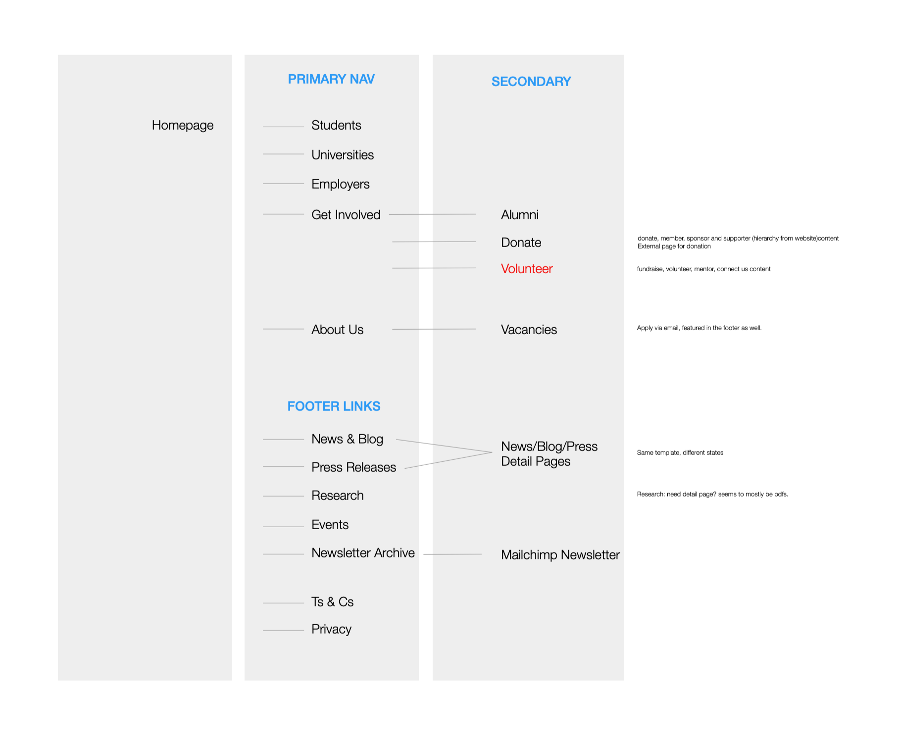
The upReach website had been incrementally modified over the years, resulting in a text-heavy and cluttered user experience lacking a cohesive structure. Working through the goals upReach wanted to achieve and evaluating who they needed to reach was a key factor is structuring the information architecture.
Problem Statement“When people think about NGOs, they usually think about long lines, endless forms, and dealing with inefficient bureaucracy. This is not what users should expect from the upReach website.”
Image: Snapshot of the new structure and navigation.
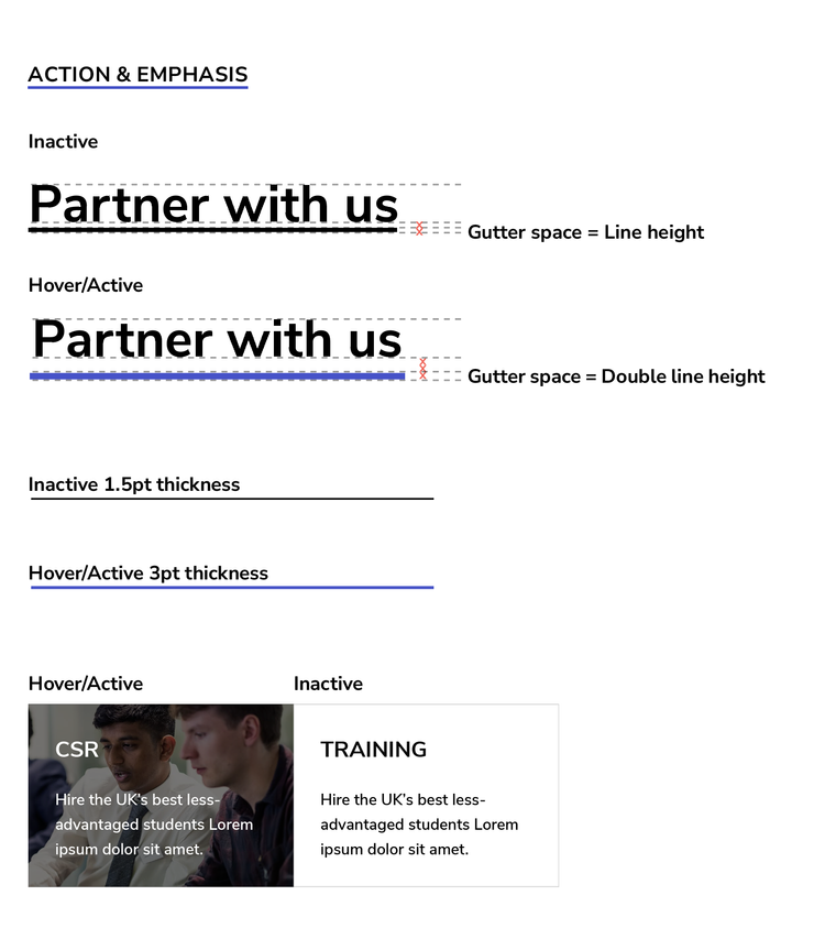
On the UI front, we started by setting up the components and type styles that would be used across the digital footprint of the brand.
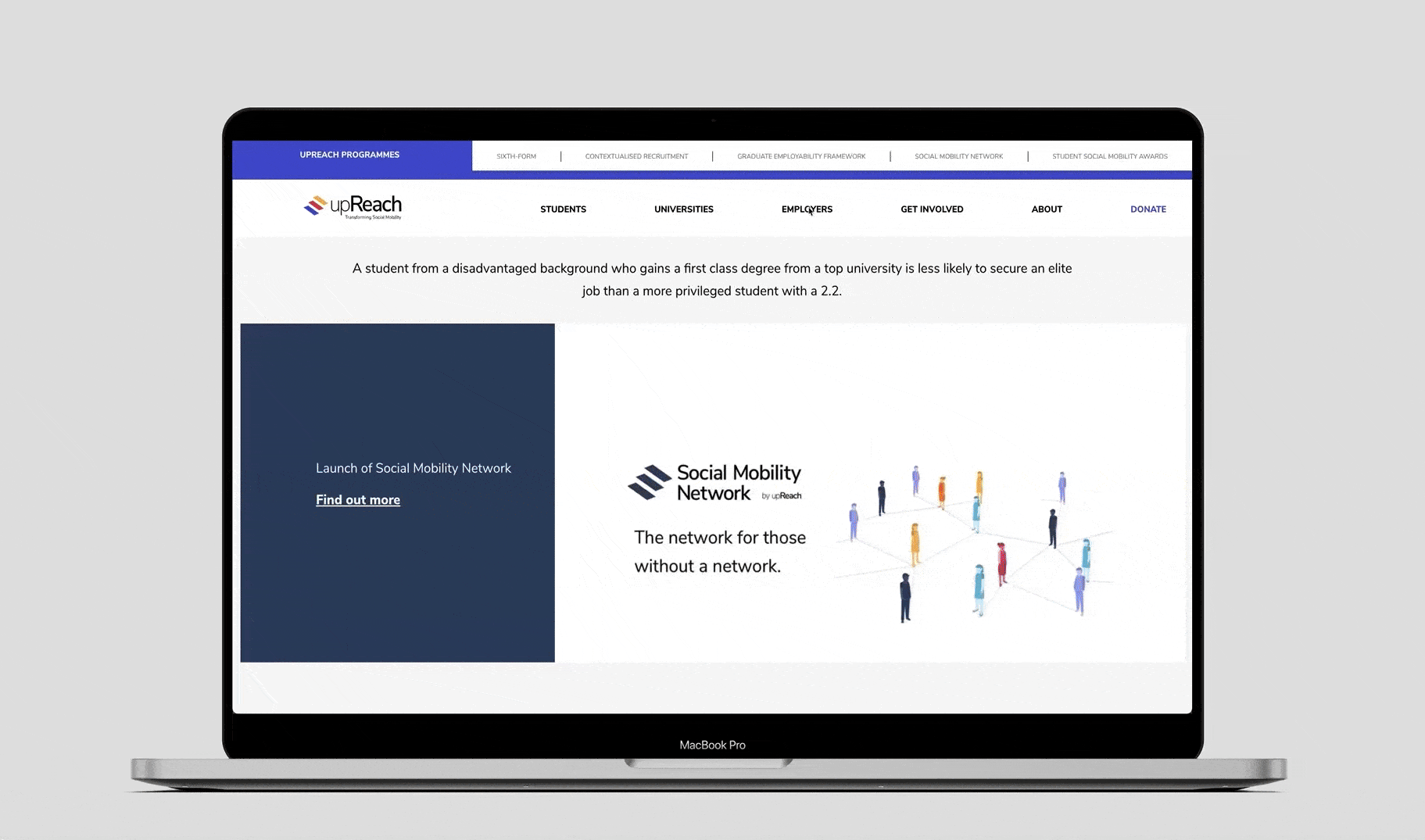
The website's goal is to provide a valuable service: an opportunity for professional development. We aimed to support this with a clean layout, captivating images, and engaging features.
User Experience Goals
Responsive Design
We aimed to make it clear that everyone is welcome at upReach. Students, parents, universities, scholarships, professors, and employers all contribute to the overall success of this organisation. We tried to use diverse imagery and create a neutral, timeless solution. A website that can stand the test of time.Inclusive by Design
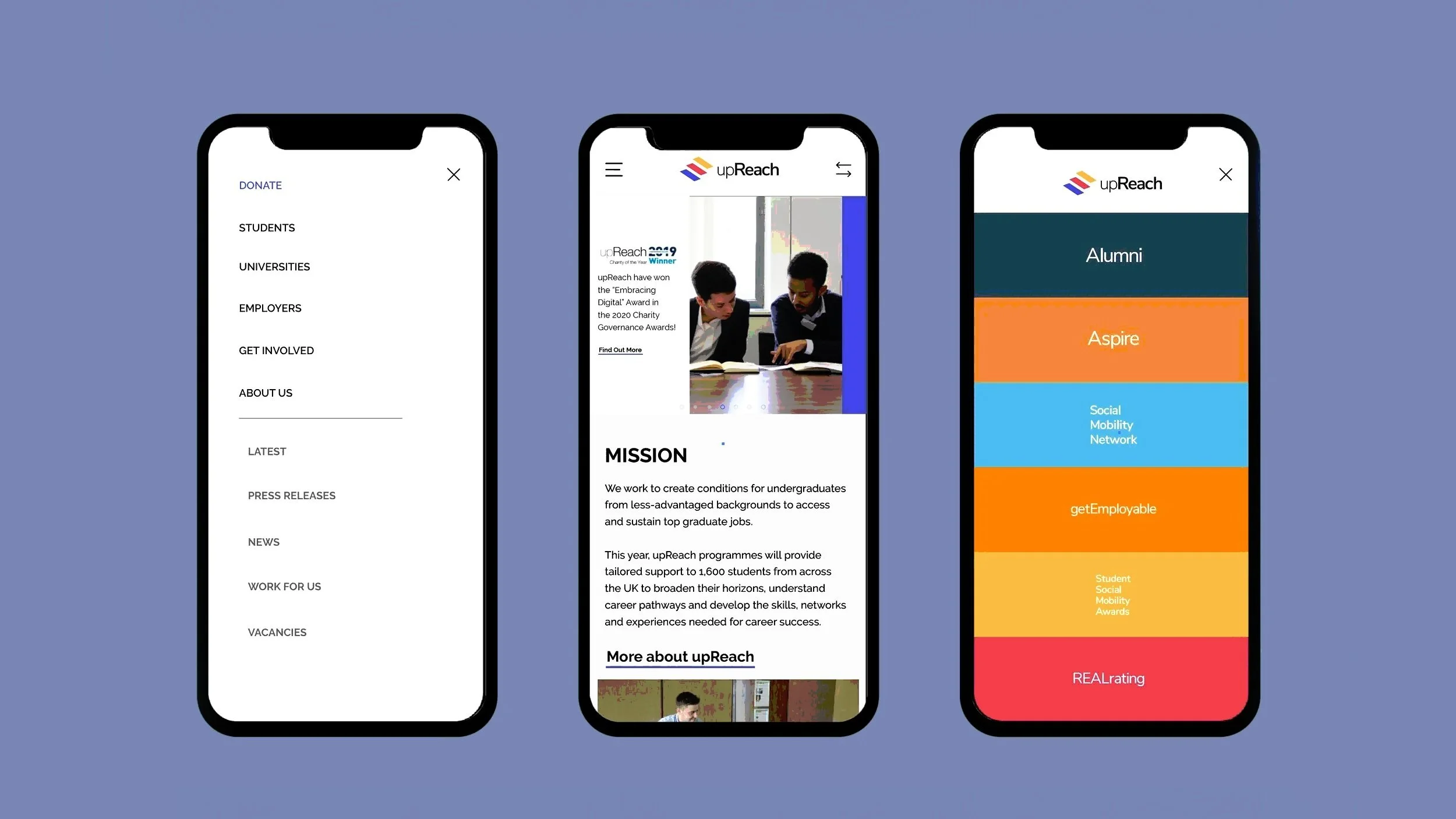
Glancability was a key goal due to the website being so information-rich. This proved to be a particular challenge on the mobile site due to the dearth of real estate on such a small screen. We highlighted the nested navigation as a full-screen dropdown menu that appears on every upReach website, which sits opposite the regular hamburger menu.

Our goal was to make the website useful, intuitive, empathetic, and meet standards in usability and accessibility.
upReach was meant to reach people of all backgrounds and abilities. We ran an accessibility check in an attempt to cover disability, age, culture, economic situation, education, gender, geographic location, language, and race.
I worked with a team of talented front-end developers to add micro-interactions and animations to make the website more useful, intuitive, empathetic, and beautiful.
